Bahan kertasnya agak kasar ,umumnya dipake untuk Fotocopy / Printer Deskjet.
kertas jenis ini banyak dijual di toko-toko buku (cthnya : Sinar Dunia, Dunia Mas, paperone,Gold,dsb)
gramasi yang umum dipakai 70 – 100 gsm
Art Paper & Matt Paper
Bahan kertas untuk brosur, karena permukaannya yang licin(artpaper), atau yang semi doff (matt paper).
selain karena licin, hasil yang dihasilkan juga bagus, karena raster kertasnya halus
gramasi yang umum dipakai 100 – 150 gsm
Art Karton
Bahan kertas ini sama seperti art paper, cuma gramasinya lebih tebal.
Banyak digunakan untuk cetakan seperti kartu nama, katalog, co profile,brosur, dan cetakan lainnya yang membutuhkan kertas agak tebal.
Umumnya setelah di cetak, bahan ini di lapisi laminating lagi (optional), supaya hasilnya lebih memuaskan.
Gramasi yang umum dipakai 210gr , 230gr , 260gr , 310gr , 360gr.
Duplex (coated)
Bahan duplex ini gampang dibedakan dengan bahan lainnya. sisi depan putih, sisi belakangnya abu-abu.
jadi yang dicetak cuma 1 sisi depan, bahan ini banyak digunakan untuk pembuatan box. karena harganya yang relatif murah dibandingkan bahan lainnya.
Gramasi yang umum dipakai 250gr , 270gr , 310gr, 350gr, 400gr .
CWb/duplex putih
Sama seperti duplex cuma bedanya bagian dalamnya putih,sehingga kelihatan lebih bersih. Banyak digunakan untuk box – box makanan.
Gramasi yang umum digunakan 230gr, 250gr, 300gr.
Ivory
Bahan ivory ini hampir sama seperti art karton, 2 sisinya putih, cuma ngak seputih art karton. Yang membedakan kalo art karton 2 sisinya licin. ivory cuma 1 sisi yang licin, mirip cwb cuma lebih halus cwb. Bahan ini juga banyak digunakan untuk box cosmetic, karena cukup tebal/kokoh.
Gramasi yang umum digunakan 210gr, 230gr,250gr,270gr, 300gr,350gr.
Samson Kraft
Warna kertasnya coklat muda, bahannya daur ulang, permukaannya kasar.
Umumnya digunakan untuk kertas bungkus, namun karena kesannya klasik, jadi bahan ini juga banyak digunakan untuk pembuatan paperbag, hangtag, amplop folio,
karena warna dasarnya coklat, umumnya dicetak 1-2 warna aja.
Gramasi yang umum di gunakan 150gr , 220gr(kartoon).
Bw/BC/Manila
Kertas ini ber-texture, biasanya digunakan untuk Stofmap, Kartu Stock barang. Terdapat berbagai warna. Biasanya gramasinya cuma tersedia 1 macam, misnya 210gr.
Jasmine
Bahan jasmine ini banyak digunakan untuk membuat undangan pernikahan. kertasnya agak gliter-gliter. tersedia berbagai pilihan warna. Gramasinya umumnya cuma 2 ukuran tipis dan tebal.
Corugated (gelombang)
Sesuai namanya, corugated ini karton gelombang. (seperti box indomie, dibagian dalamnya ada gelombang). Box ini kalo di cetak, umumnya di tempel lagi, ada yang ditempel pake duplex, kraft atau hvs.
Jadi kalo dicetak fullcolor , dicetak dulu di bahan lain baru nanti di tempel.
untuk ketebalannya bahan ini dikategorikan B flute (gelombang besar ) & E flute (gelombang kecil).
Boleh dibilang, dari semua kegiatan membuka sebuah perusahaan baru,
hal yang paling menyenangkan sebenarnya adalah membuat logo dan kartu nama
perusahaan tersebut. Anda dapat membubuhkan karakter perusahaan pada
kartu nama Anda, dan memberikan first impression yang menarik bagi
kolega-kolega dengan hanya secarik kertas yang muat masuk ke dalam
dompet, Benar-benar hal kecil yang bermakna besar. Untuk itu, karena
begitu besar dampak yang diberikan oleh sebuah kartu nama, Anda tak
boleh sembarangan dalam membuatnya. Bukan hanya desain yang harus
dipikirkan, tetapi juga bahan kertas yang Anda gunakan, sebab tekstur
kertas juga mencerminkan karakter perusahaan yang ingin Anda bangun.
Selain itu, pikirkan pula, manfaat atau tindakan apa yang Anda ingin
orang lakukan terhadap kartu nama Anda, sehingga dari sana, Anda akan
dapat menemukan bahan kertas yang cocok untuk kartu nama Anda. Berikut beberapa jenis kertas yang paling umum digunakan untuk kartu nama:
Art Paper/ Art Carton
Beratnya/ ketebalannya 260 gsm, cukup tebal untuk kartu nama,
permukaannya sedikit licin atau mengkilat, sehingga sulit ditulisi
dengan bolpen. Jadi jika Anda mengharapkan si penerima kartu nama
mencatat sesuatu tentang Anda atau perusahaan Anda, jangan gunakan
jenis kertas seperti ini. Kertas ini cocok untuk desain kartu nama
dengan blok warna. Art Carton juga otomatis digunakan jika finishing
akhir setelah cetak adalah laminasi doff atau glossy.
BW
Berukuran 250 gsm, tampilannya seperti kertas manila putih,
tidak mengkilat, sedikit kaku, namun mudah ditulisi. Jenis ini hanya
dapat dicetak satu sisi.
Mohawk Option
Kertas import berukuran 250 gsm ini memiliki tekstur yang halus
mirip dengan kertas BW, namun dengan daya serap tinta yang lebih bagus,
sehingga hasil cetak sudah pasti lebih memikat mata. Jadi jika Anda
adalah penyuka desain, Anda akan menyukai kertas ini. Lagipula,
kelebihan Mohawk Option dibandingkan dengan BW adalah kertas ini dapat
dicetak dua sisi atau bolak balik. Jadi Anda dapat lebih bebas berkreasi
dengan desain kartu nama Anda.
Linen Jepang
Berukuran 250 gsm, kertas ini merupakan kertas local yang
memiliki tekstur garis-garis horizontal dan vertical. Tekstur yang cukup
menarik untuk mewakili karakter perusahaan Anda. Biasanya memberi kesan
professional yang tidak berlebihan.
Linen Holland
Juga berukuran 250 gsm, Linen Holland merupakan kertas impor
yang sejenis dengan linen Jepang, dengan tekstur yang lebih halus, lebih
putih, dan sedikit lebih tebal. Kertas ini memberi kesan eksklusif pada
kartu nama Anda. Jenis-jenis Kertas untuk Kartu Nama
Boleh dibilang, dari semua kegiatan membuka sebuah perusahaan baru,
hal yang paling menyenangkan sebenarnya adalah membuat logo dan kartu nama
perusahaan tersebut. Anda dapat membubuhkan karakter perusahaan pada
kartu nama Anda, dan memberikan first impression yang menarik bagi
kolega-kolega dengan hanya secarik kertas yang muat masuk ke dalam
dompet, Benar-benar hal kecil yang bermakna besar. Untuk itu, karena
begitu besar dampak yang diberikan oleh sebuah kartu nama, Anda tak
boleh sembarangan dalam membuatnya. Bukan hanya desain yang harus
dipikirkan, tetapi juga bahan kertas yang Anda gunakan, sebab tekstur
kertas juga mencerminkan karakter perusahaan yang ingin Anda bangun.
Selain itu, pikirkan pula, manfaat atau tindakan apa yang Anda ingin
orang lakukan terhadap kartu nama Anda, sehingga dari sana, Anda akan
dapat menemukan bahan kertas yang cocok untuk kartu nama Anda. Berikut
beberapa jenis kertas yang paling umum digunakan untuk kartu nama:
Art Paper/ Art Carton
Beratnya/ ketebalannya 260 gsm, cukup tebal untuk kartu nama,
permukaannya sedikit licin atau mengkilat, sehingga sulit ditulisi
dengan bolpen. Jadi jika Anda mengharapkan si penerima kartu nama
mencatat sesuatu tentang Anda atau perusahaan Anda, jangan gunakan jenis
kertas seperti ini. Kertas ini cocok untuk desain kartu nama dengan
blok warna. Art Carton juga otomatis digunakan jika finishing akhir
setelah cetak adalah laminasi doff atau glossy.
BW
Berukuran 250 gsm, tampilannya seperti kertas manila putih,
tidak mengkilat, sedikit kaku, namun mudah ditulisi. Jenis ini hanya
dapat dicetak satu sisi.
Mohawk Option
Kertas import berukuran 250 gsm ini memiliki tekstur yang halus
mirip dengan kertas BW, namun dengan daya serap tinta yang lebih bagus,
sehingga hasil cetak sudah pasti lebih memikat mata. Jadi jika Anda
adalah penyuka desain, Anda akan menyukai kertas ini. Lagipula,
kelebihan Mohawk Option dibandingkan dengan BW adalah kertas ini dapat
dicetak dua sisi atau bolak balik. Jadi Anda dapat lebih bebas berkreasi
dengan desain kartu nama Anda.
Linen Jepang
Berukuran 250 gsm, kertas ini merupakan kertas local yang
memiliki tekstur garis-garis horizontal dan vertical. Tekstur yang cukup
menarik untuk mewakili karakter perusahaan Anda. Biasanya memberi kesan
professional yang tidak berlebihan.
Linen Holland
Juga berukuran 250 gsm, Linen Holland merupakan kertas impor
yang sejenis dengan linen Jepang, dengan tekstur yang lebih halus, lebih
putih, dan sedikit lebih tebal. Kertas ini memberi kesan eksklusif pada
kartu nama Anda.
Kartu PVC (Polyvinyl Chloride) merupakan jenis kartu plastik yang umumnya digunakan
dalam proses pembuatan id card dengan menggunakan printer , kartu ini biasa kita lihat
pada kartu Kredit, kartu ATM bank, kartu membership, kartu discon dll.
proses pembuatan kartu plastik ini ada beberapa teknik cetak antara lain cetak sablon
cetak offset, cetak digital printing dan cetak thermal transfer menggunakan mesin idcard printer
standar ukuran id card yaitu CR-80 (8.56 x 5.4 cm) dengan ketebalan 30
mil/0.762 mm seperti kartu yang selama ini beredar dimasyarakat karena
merupakan Standard ISO
produsen kartu PVC cukup banyak, tapi kartu PVC yang cocok untuk produksi cetak thermal transfer
id printer keluaran HID UltraCard blank White PVC
bentuknya yang putih polos sebagai area cetak dibagian depan dan belakang kartu full color
jenis kartu PVC
kartu PVC sebagai bahan utama cetak id printer ada beberapa macam berdasarkan untuk penyimpanan datanya
Kartu Magnetic
kartu ini permukaan depannya putih polos dan dibagian belakang diletakan pita magnetic berwarna hitam
atau magnetic stripe, fungsinya untuk menyimpan data dikartu, yang nantinya dapat dibaca dengan
mesin pembaca kartu magnetic , model ini banyak terdapat pada kartu kredit card/ kartu ATM bank
proses cetak pada idcard printer ditambahkan modul encoder untuk memasukan datanya langsung dari printer
kartu magnetic ini ada 2 jenis yaitu yang HiCo (high coercivity) kerapatan magnetic 4000 Oe dan LoCo (Low Coercivity)
kerapatan magnetic 300 Oe atau secara umum yang HiCo lebih lama
menyimpan datanya sehingga tidak hilang walau digesek dengan magnet
sedangkan yang LoCo lebih cepat hilang bila dikenakan magnet.
Kartu Proximity / Proximity Card / RFID smartcard contactless
kartu proximity adalah jenis contacless card yang didalamnya ada kumparan/lilitan tembagai
sebagai penerima sinyal umunya data sudah dibuatkan dari pabrik pembuatnya
frekwensi yang umum pada alat pembaca/card reder proximity adalah 125 KHz
walaupun sekarang ada yang lebih tinggi.
standard umumnya yaitu ISO/IEC 14443 dan ISO/IEC15693 jarak baca umunya 0-3 inch
secara umum kartu ini sudah banyak digunakan untuk absensi , acces control dll.
Kartu MIFARE / contactless card
kartu ini sama seperti kartu Poximity tapi ada kelebihanya data yang disimpan dapat dihapus
untuk diganti dengan data lain karena didalamnya ada IC, kapasitor & kumparan
Kartu Chip /smartcontact card /smartcard
kartu chip adalah smartcard karena kartu ini menyimpan datanya pada chip
bentuknya seperti yang terlihat pada kartu telepon dan kartu kredit
Kartu Adhesif
kartu jenis stiker yang permukaan depan putih untuk cetak pada id printer dan permukaan
belakangnya stiker/ada perekatnya. biasa digunakan pada kartu jenis proximity, karena
harganya yang masih mahal sehingga bila tidak digunakan oleh karyawan lain/karyawannya
sudah keluar bisa dilepas diganti dengan stiker baru.
Kartu Preprinted / Preprinted Card
kartu PVC ini dibuat dengan menggunakan cetak sablon / offset , untuk
design yang dibuat tidak dapat dicetak warnanya dengan id printer, serta
untuk mempercepat proses produksi .sedangkan untuk personalisasinya
dengan menggunakan id printer.
Mengunduh
berbagai piranti lunak di bawah lisensi creative common merupakan hal
biasa. Opendesk menawarkan para desainer, pengrajin kayu, dan siapa pun
yang tertarik, untuk membuat furniturnya sendiri.
Mengunduh berbagai piranti lunak di bawah lisensi creative common
merupakan hal biasa. Namun, bagaimana dengan mengunduh furnitur?
Opendesk menawarkan para desainer, pengrajin kayu, dan siapa pun yang
tertarik, untuk membuat furniturnya sendiri.
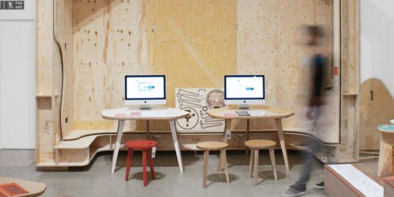
Opendesk merupakan koleksi furnitur yang bisa diunduh oleh siapa pun secara gratis lewat situs www.opendesk.cc.
Perusahaan ini menyasar komunitas kreatif di seantero internet. Para
desainer dan arsitek yang terlibat dalam proyek Opendesk percaya bahwa
pabrik masa depan ada di mana-mana.
Beberapa set furnitur yang
bisa diunduh saat ini tengah dipajang di Museum Desain London dalam
pameran bertajuk "The Future is Here". Koleksi Opendesk sejajar dengan sister project Wikihouse. Sedikit berbeda, Wikihouse merupakan set open source untuk membangun rumah.
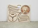
Berbagai
produk dalam pameran "The Future is Here" tersebut diciptakan oleh
desainer yang berasal dari seluruh dunia. Konsep furnitur yang
ditawarkan sebenarnya sederhana. Pihak pengunduh dapat menggunakan
material lokal dan mengolaborasikannya dengan file yang telah
diunduh sebagai cetakannya. Setiap desain pun memiliki kode QR yang
dapat dipindai untuk melihat garis waktu spesifik tiap desain, termasuk
foto, serta video pemasangan serta informasi pembuat desain.
Sayangnya,
teknologi praktis yang diperlukan untuk "membangun" kembali berbagai
furnitur hasil unduhan belum tersedia secara massal. Mungkin di
tahun-tahun mendatang, berbagai peralatan yang diperlukan akan tersedia
di setiap rumah. Saat ini hanya beberapa instansi yang sudah
menggunakannya sehari-hari.
Siapa pun yang ingin mencetak
furnitur hasil unduhannya membutuhkan mesin CNC (Computer Numerical
Control), sistem otomatisasi mesin perkakas. Mesin ini bekerja dengan
program CAD. Namun, tak usah khawatir, jika tidak memiliki mesin CNC,
pengunduh juga bisa mencetak desain dan memotong sendiri bagian-bagian
perabotan pada sepotong kayu.
Anda tertarik membuat meja-meja unik hasil unduhan?
Thiago Storino
is a Brazilian artist with experience in post production, photo
manipulation, retouching and illustration. In this article, we will take
a look at some of our favorite work from his portfolio.
Alexis Persani
is a French artist with a talent for producing some pretty incredible
photo manipulations. In this article, we will take a look at some of our
favorite pieces from Persani’s portfolio.
As an artist, your job is to immerse your viewers into a world that
you have built and guide them safely through it. Artists have much in
common with storytellers. Storytellers have several tricks that they use
to keep their readers coming back for more. Like storytellers, artists
can use similar tricks to help them produce more compelling artwork. In
this article, we will explain 5 fundamental skills that every artist
should master. Let’s take a look!
1. Composition
The
most important aspect of art to me personally is the composition. It
sets the stage for everything else. This is your way to guide and lead
the viewer to make them feel as if they are actually in your picture. If
this part of the process is not created and controlled properly,
everything else can and probably will fall apart. That doesn’t mean that
you have to follow every little rule. In fact, many have broken them
and created very successful works of art. It’s knowing how and when to
break them that will allow you to do it successfully. But before
attempting anything like that, you first need to learn the rules and see
how they work and function.
Rule of Thirds
This is the
simplest and most used composition technique, one that I use a lot
myself. Because it is simple to learn, it’s something that is
recommended for beginners and those who are new to the fundamentals of
composition. When used, it will divide the picture into 9 equal parts
that are separated by two horizontal and vertical lines.
The main
idea behind this is to place your most important element/object on one
of the intersections where the lines converge (the +’s), as well as
along or near the vertical line of wherever your focal may lie.
It
is believed that when this is used and your subject/focal sits on one
of these spots, it creates more interest in your picture rather than
having it centered. Dock by John PowellThe remains which live by Keisuke AsabaWay of the Wizard
Iconic
In
contrast to what was stated above, this particular composition sets the
focal point directly in the center of the picture. Although it is
mostly used for character-based pieces, that does not mean it can’t be
used for other means, it also explains why a central focal point is
desired.
For character artists, one of their goals is to place the
character right in front of you and draw as much attention to it as
possible. There is no better way than to put them right in the center of
things. Which is why this composition is most appealing for characters
(but again, don’t let that sway you from experimenting).
In
addition to the central focus, the diamond shaped guide shows us where
we should be placing most of our attention and detail. The viewer
obviously won’t be seeing your work with these guides on, so you must
show them what is most important in your piece through lighting, color,
detail and many other things. Anything outside of this diamond is not
nearly as important and should not attract as much or more attention
than what is inside of it.
You can use these basic guides either
as a starting point for more complex compositions or to create an entire
piece. The choice is up to you, but my suggestion is to learn about
them completely before taking on more complex compositions. Also, there
are more composition rules and examples out there that bring up many
other points than what I list here. I encourage you to search them out
and read them. PI-2 by Marek Okon (Left). Blood Divided by Dan Santos (Center). Inject Me by Marc Simonetti (Right).
Leading the Eye
Now, let’s take a look at some other examples of how to direct the viewer’s eye to the focal point.
In
PI-2, you can see how the light immediately locks your eye into the
focal point because of the strength and intensity. Other factors of this
are color, placement within composition (rule of thirds) and because
almost everyone in the scene is looking at the focal point it creates an
implied line and causes you to as well. What keeps us locked into the
focal point here however is the circular motion of the people floating
in the air. PI-2 by Piotr JablonskiIn
Crysis 2 (below), the artist used light, color and placement within
composition to guide the focal point. The most obvious and beautiful
lights are coming from the spotlights and headlights from the vehicle,
which all point towards the focal point. Secondly you have gunfire from
the weapons converging on it, leading your eye directly towards it.
Lastly, the artist used the rule of thirds for placement in this
composition. Another point could be made for how much action is being
taken place within that area. All of these have lead to a successful
piece that clearly defines the focal point and the areas surrounding it. Crysis 2 – Concept 04 by Marek OkonIn
the piece below, the artist uses the walkways that form around the
pillar to lead the viewer into the focal point. As the dragons fly
around it we follow them, which keeps us in this area longer. Because
the pillar is in shadow and bright light is directly behind it, the
artist has also used values and contrast to make it stand out even
further. Nest by Tuomas KorpiIn
the artwork below, I used a number of elements to direct the viewer’s
attention to the focal point (the castle). The arch in the background
and the bridge over the waterfall are both going directly into the
castle. Since the image has a slight angle, all of the mountains appear
to be leading to the castle, which helps point the viewer in that
direction as well. One other thing helping the castle stand out is the
color used on the tops, which is contrasting against the yellows, greens
and reds that surround it. Sorcerer’s HillIn
the image below, I have shown how you can keep the viewer’s eye from
easily escaping the image via framing. You can probably see how this
works just by looking at the image. But what I’ve done here was use the
“arm” parts that are coming out from the red entity as a way to frame
the image. This technique can be used to “lock” the viewer in the piece
and keep them in longer. It can be overdone, but if you keep it to a
reasonable level, it can come in handy. One downside to this, especially
if overused, is that it can become annoying and make the viewer want to
leave sooner. Eradicate
2. Perspective
Everything
has a perspective. When standing in the street, look around and notice
which side of the buildings you can see and why you see them all from
different viewpoints. Then while you’re at it, go ahead and look down a
road, why does everything appear to get smaller as its distance is
further away from you? All of these things have to deal with the
perspective of those objects and your viewpoint.
Perspectives are
an essential skill to learn, for architectural, environmental and many
other reasons. They provide us with a way to create and build elements
and objects and correctly place them within the picture plane.
Perspectives rely on the horizon line (or sometimes called the eye level
line) to find what is called a Vanishing Point. Vanishing points are where your perspective lines will originate (see below examples).
One-Point Perspective
This
is the simplest of all perspectives to learn, but one that is not
widely used a whole lot because of its limitations. That being said, it
can be very beneficial, depending on what scene you are creating. In
this perspective, there is a single vanishing point going back to the
horizon line, which the object is receding to. One-Point Perspective2001: A Space Odyssey by Stanley Kubrick
Two-Point Perspective
When
more than one side of your object is receding back to multiple areas,
you will need to use a two-point perspective system. When used, you will
create two vanishing points, each on one side of the object/element.
These points will again originate from the horizon line, and the
perspective lines will run from this point all the way to the object.
There is where you can really start to see perspectives shift.
Most
times your vanishing point will be way outside of your picture, but
don’t worry. If working traditionally, you can always use extra paper to
measure the exact distance. If working digitally, extend the canvas out
until you find your vanishing point. Two-Point PerspectiveMysterious Street by Lukasz Taborski
Three-Point Perspective
The
three-point system is used when you really want to convey an extreme
situation. It can be useful for scenes that are playful (doing a scene
from a bird’s or dog’s eye view), exciting (action), and many more. To
achieve this perspective, you will be using the exact same system from
the two-point, but adding in a third vanishing point that is either
above and below the object/element.
The third point acts exactly
the same as the other two, so don’t get tripped up by it, there’s
nothing sneaky about it. The only difference here is that the top or
bottom (the verticals) of your object will adhere and recede back to
this point. Which is what gives us that warped look and feel.
Values
are the range of brightness and darkness within your image. They are
white, black and everything in between. Even with color, how dark or
light that color is (tints or shades) is a value. The closer something
is to the foreground, the darker it will appear (depending on lighting
and other things, of course), anything receding away from it will
gradually get lighter as it fades into the horizon (in terms of
landscapes). Take a look at the graph below and use it as a reference
for when we discuss this more in depth further down. Even
more so than colors, the values of your work are one of the most vital
elements of whether or not your piece will be successful. If the values
do not read correctly (being able to distinguish FG from MG to BG,
and/or the focal point from the surrounding area), then it won’t matter
how great your composition, lighting and colors are, the piece as a
whole will fail because the values don’t read properly.
So, what
do I mean by them being able to read properly? Well, let’s take a look.
The image below is a value study by Claire Almon that was done for one
of her Marie Antoinette pieces (further WIP with color is posted below
this image). Take note of all of the different values within the image
and how you can clearly distinguish each element apart from the other.
Values help determine the overall lighting in your scene and how one
object looks against another (which can help with composition and a
whole list of things). The Almon TreeMore
importantly though, values separate distances within the ground plane,
and it’s with this separation, when done correctly, that allows the
viewer to read your work the way you intended and lead their eye to the
focal point. It’s from here that you can then work on and begin
finalizing your color schemes as shown below. The Almon TreeThe Almon TreeHere
are a couple more examples of using values correctly. Take note of the
different values used within one single image/design to help tell each
element apart. Feng Zhu Design BlogFeng Zhu Design Blog
4. Color
Much
like lighting, the color of your piece depends on many things; the time
of day, season, location and so on. Determining the color scheme is
important to do early on, even from the start if you can. Remember that
things will always change and evolve, so the colors of your piece most
likely will as well. As with everything, just because something looks
good at one point, doesn’t necessarily mean it always will. So don’t be
afraid to mix things up along the way and find something that might be
better suited for what you’re working on. Keep in mind that it’s very
easy to go overboard with color as well, so know when not to mess with
it.
Knowing how to choose your color scheme depends on the time of
day, the weather/sky, what season of the year it is, and whether or not
you’re on an alien planet or in space. There are countless things that
could help shape the colors of your painting, so it’s best to get an
idea of what they are sooner than later to minimize headaches before
heading into the final stages.
The color you choose should display
any emotion or situation you want to convey to the viewer. If you have a
fun or action piece, bright and vibrant colors might be your best bet
to display that sense of action and intensity. If you’re going for
something a little more moody and withdrawn, you could then always opt
for a darker and less saturated overall color scheme, but have your
focal point be the more vibrant than the other parts. There are many
variables that can lend to what type of color you use for your piece.
Your job is to figure out which of them will work best.
Here are some examples of how color is used effectively to help storytelling, emotion and to guide the viewer’s eye:
In
the GOLEM image, the artist has built strong color around the focal
point, which clearly signifies where most of your attention should be
payed. The colors that surround the toy figure lend to this piece’s
playful nature, as well as add a layer of mystery and fantasy. The outer
parts of the composition have earth tones, which are not too saturated.
This helps the focal point further stand apart from the rest of the
image (while maintaining balance) and allows for the playful side of the
subject/theme to be fully explored. GOLEM – toys and magic by Randis Albion Here
we have a contrast of color, which makes the focal point stand out.
This is one of the most-used ways of using color to achieve good
composition because it is both effective and dramatic in terms of
composition and storytelling. Nemeroths Fall by Roberto RobertIn
this piece, I used the holographic screens on the landing pads to set
it apart from all of the other elements in the scene. Since it is the
most saturated part in the composition, I knew the viewer’s eye would
always eventually gravitate back to this area because it was the most
interesting. I also wanted the feeling of an older science fiction work,
so I stayed away from really vibrant colors. Station.4
5. Lighting
Like
all major elements of art, lighting is crucial. Mainly because the
average viewer knows what realistic lighting looks like, even if they
don’t know exactly what it is that makes it look real. They can usually
tell if something is working or not. Sometimes you can get lucky and
fool them, but most times it can break your shot and make all the hard
work that was put into your piece wasted time and work. And that’s
definitely not what we want.
So, in order to know how light reacts
to the environment and different materials, go outside and study it. If
you are basing a piece off of something else (e.g., you’re your
photographic plate in terms of matte painting or anatomy for painters),
study it until you can confidently tell somebody else how it looks,
feels and functions. Using photos is fine, but there’s an almost
infinite source just outside those walls you are in waiting for you.
Much like color, lighting can convey much emotion and depth. Let’s take a look at how this can be achieved.
Once
again, in the image below, there is strong lighting that’s being cast
on the focal point. The shadows in the foreground create depth in the
image and allow for the viewer to get a clear view of the focal area
without the foreground going unnoticed. Because the foreground is in
almost complete shadow and the midground is where we see most of our
light, this allows for the viewer to have a greater impact on the focal
point and what is happening in the scene. Almost immediately they see
the destruction of the world around them as if they were there on the
street. Skyscraper lost by Ioan DumitrescuBeing
a master of his craft, this piece by Dylan Cole makes no exception.
Both the foreground and background are lit to display all of the work
that went into it, while the composition is pushing you into the
background towards the focal point. Dylan Cole StudioDylan Cole Studio
Conclusion
So
now that we’ve covered all of these topics, I’m sure you’re wondering
how to use and incorporate them into your work. This, just like anything
else, is about becoming familiar with them and practicing until you
have a clear understanding of what they are and how to use them
properly. Remember that we all learn differently, so if it doesn’t come
easy to you don’t be discouraged. Just keep pressing on with small
studies of each of these topics. After a while of doing them, you will
notice things that you hadn’t before and that is when you will start to
learn and really push yourself.
Thanks for taking the time to read
this article. I really hope you are able to take from this and apply it
to your work and learn from it. Just remember that every great artist
that you look up to started from the bottom and had to work their way
through all of these skills. Continue to push yourself in the right
direction with a strong goal in mind and you can become great at what
you do.